CDN NEWS |
  US NEWS


Everything you may want to know about global energy but were afraid to ask
This time of year is a highlight for me as my inner nerd gets to have a who pile of data to look at. In the past BP used to do its annual statistical review of global energy, but recently they handed that baton over to the Energy Institute who has continued to carry this forward.
In this review there is a ton of data which you can dive into and it provides you some hard data to look at versus the narratives that you might hear being fed to you on a daily basis. For those of you who love looking at this stuff, I have tried to distill some of the key factors for you below, but I would also encourage you to take a look at the data yourself here. For the purposes of this review that I have done, I have limited the dataset to go from 2000 to 2024, though many of the datasets go back to 1965.
I will warn you, this is a long thread with a ton of charts, but at the end of all this I hope that you find this insightful and that you come away from this learning something.
Thanks for reading William’s Substack! Subscribe for free to receive new posts and support my work.
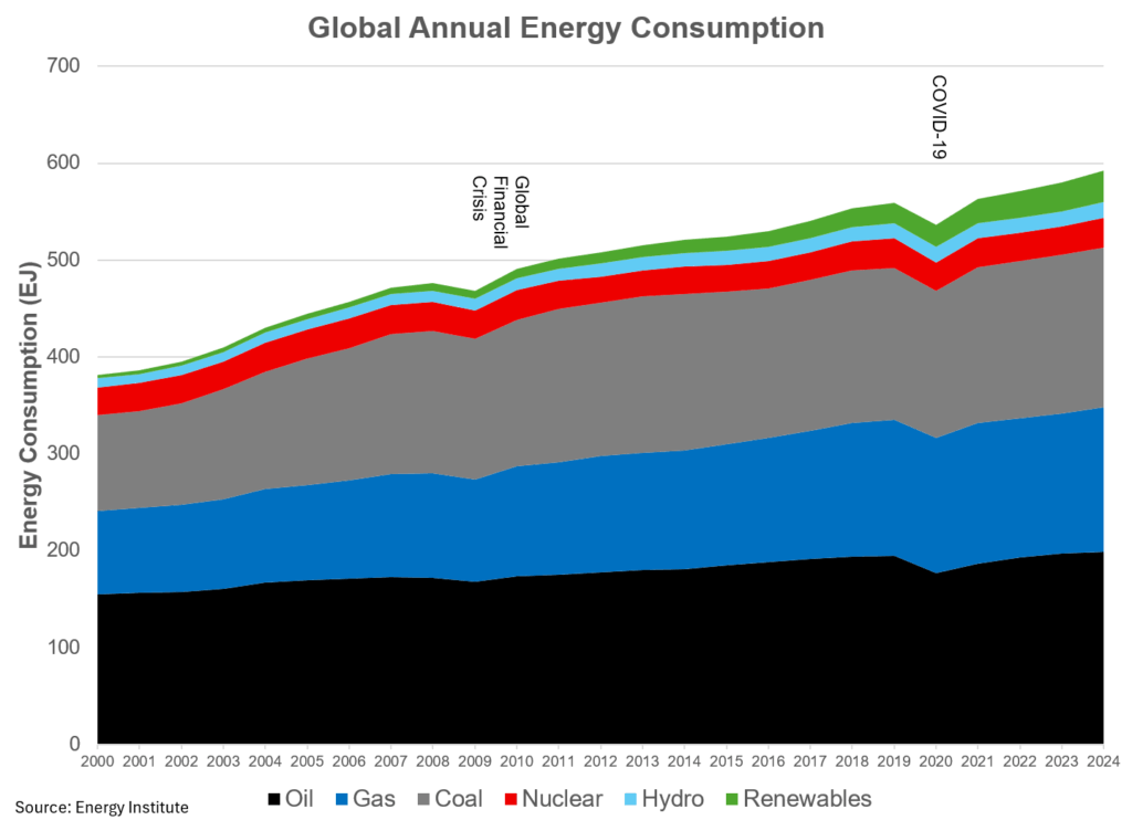
Global Energy Consumption.
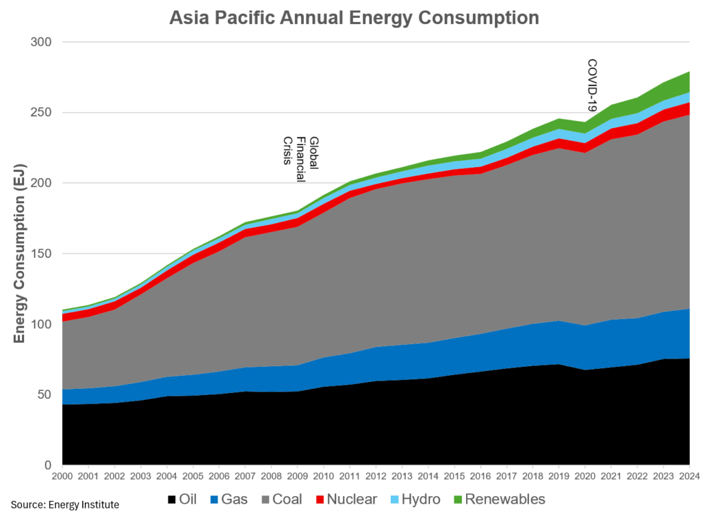
Global energy consumption continues to grow unabated, with 2024 posting yet another yearly record in terms of energy consumption. The only two periods that have seen a net decline in energy consumption were during the global financial crisis and during COVID-19. After both of these events, energy consumption roared back. This first chart is often the one that I point to when people talk about energy and energy transition. As you can see, oil is the number one fuel consumed globally, accounting for 33% of energy consumption. Coming in second? Coal at 28%. For most Western people, that is not on their energy bingo card. Natural gas fills out the non-renewable card at 25%, while clean/renewables (including nuclear) account for approximately 13% of energy consumption. In terms of growth by sector, natural gas was the leader, expanding by 4 EJ from the year prior. Next was renewables at 2.8 EJ, and coal rounds out the top three at growth of 1.9 EJ from the year prior.
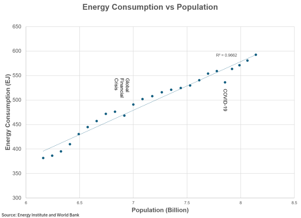
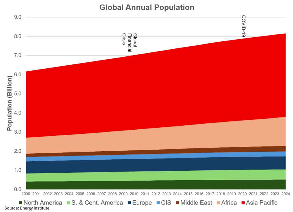
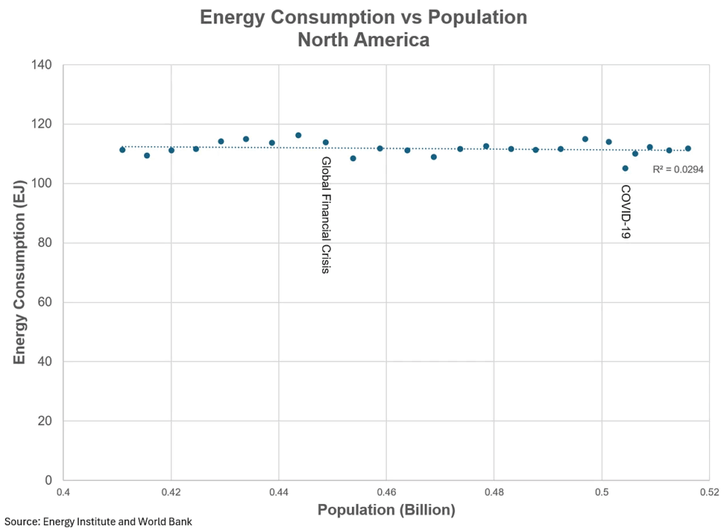
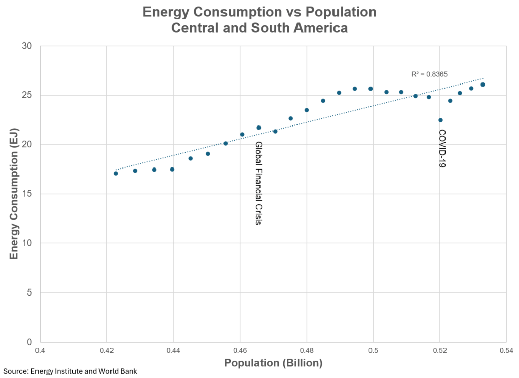
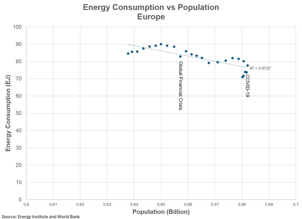
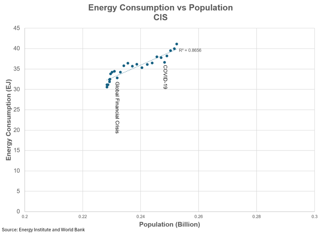
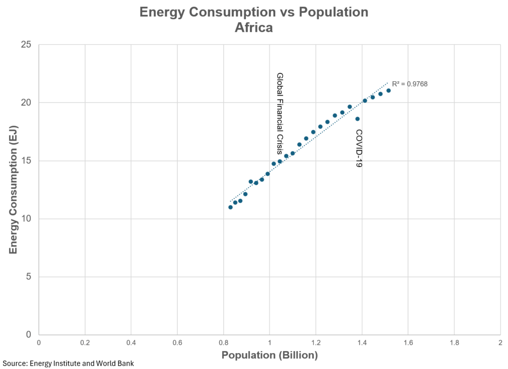
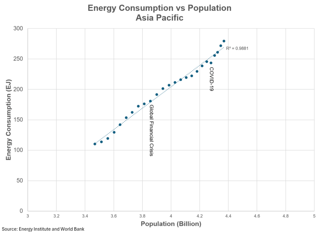
Now, when we layer in population, another interesting (and somewhat obvious) trend emerges. Namely, the more people you have, the more energy is consumed.
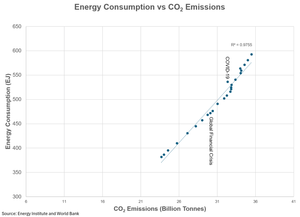
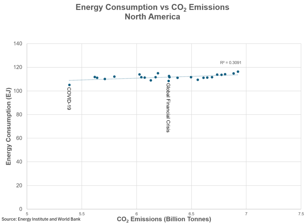
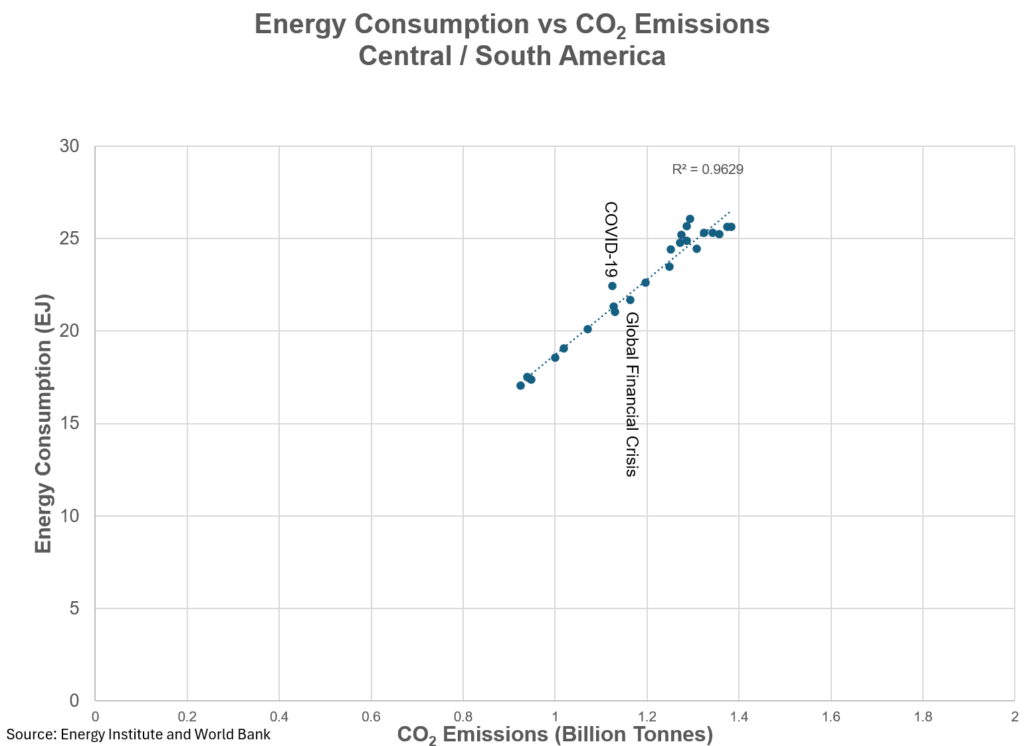
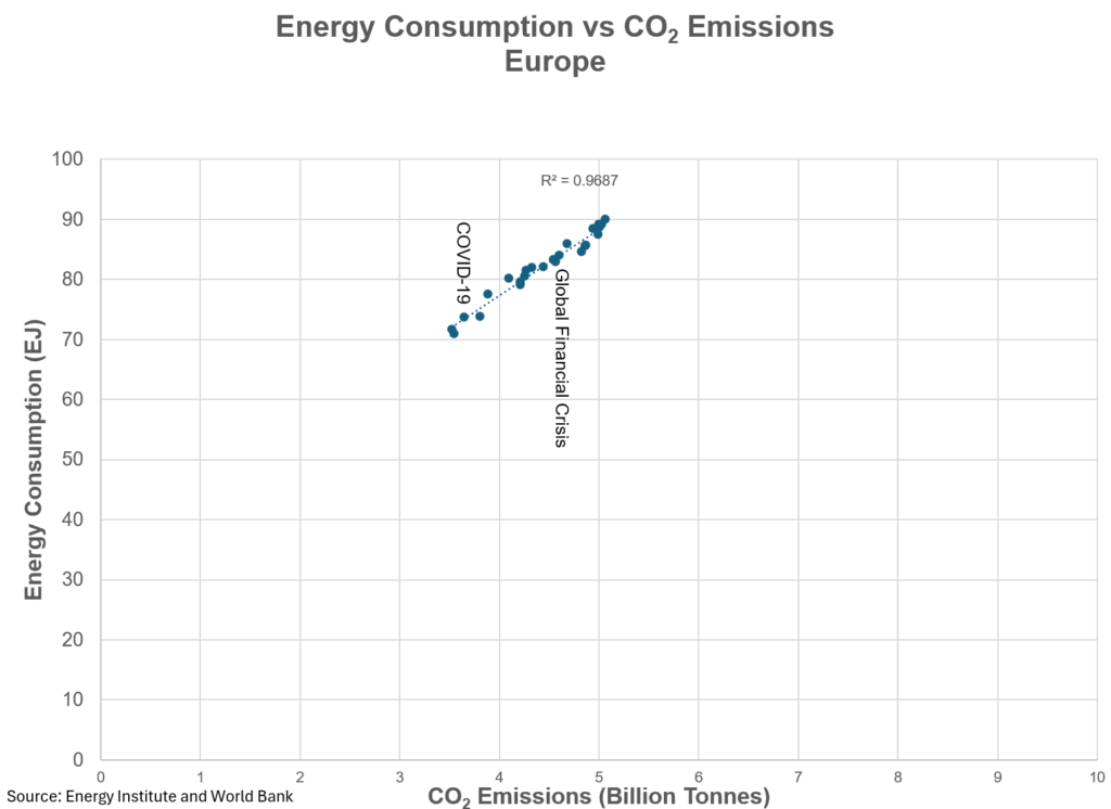
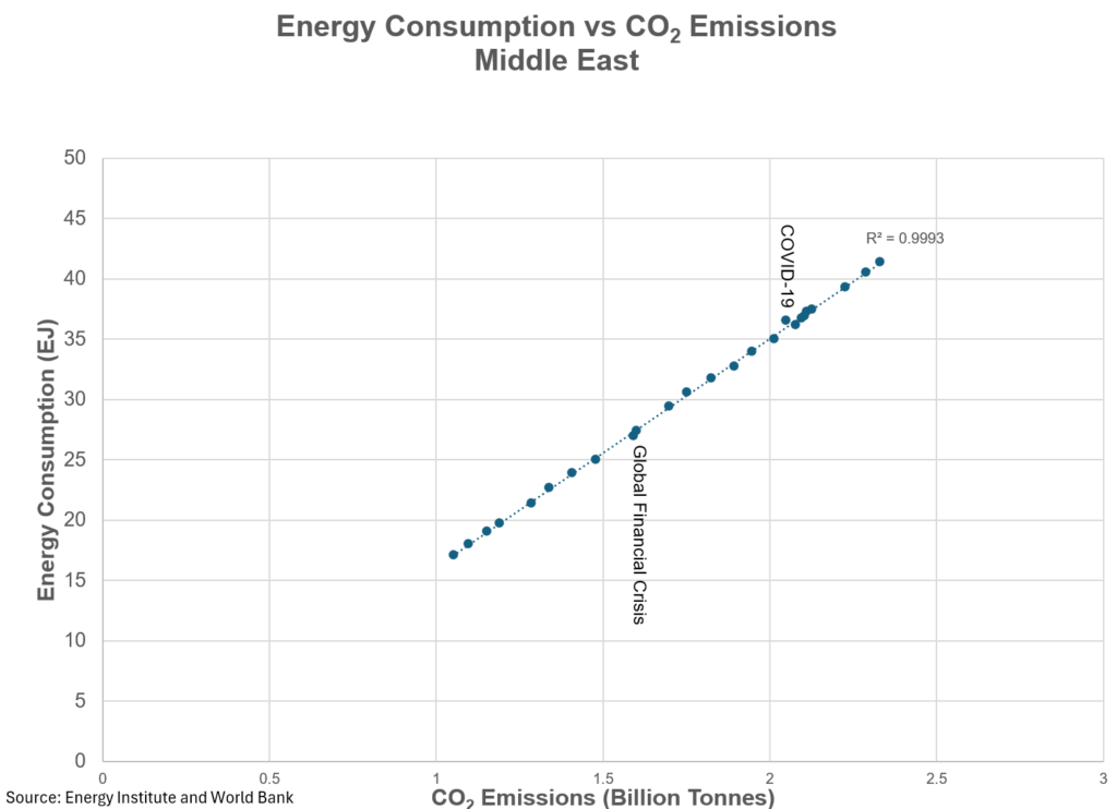
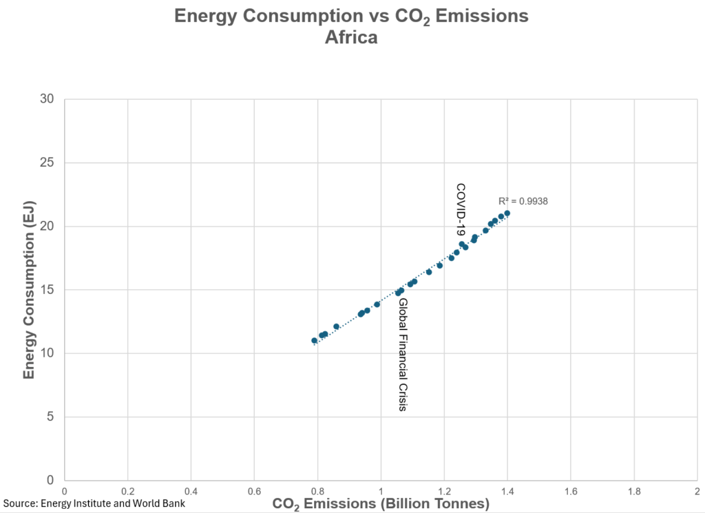
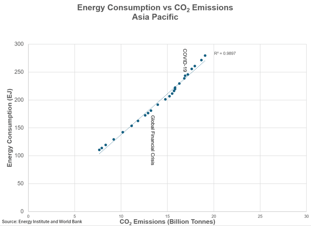
Similarly, when we look at CO2 emissions, you can see that as energy consumption goes up so too do CO2 emissions. Frankly, this should be no surprise based on information I discussed earlier, where non-renewable energy consumption grew 7.6 EJ from the year prior.
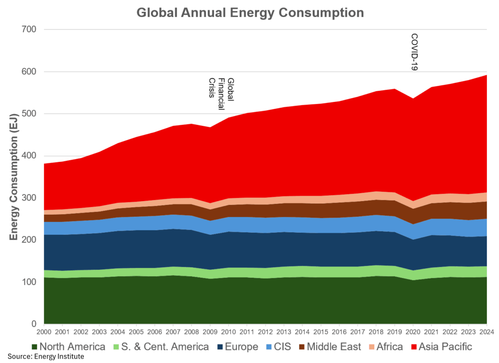
From a very high-level perspective, here is what the energy consumption picture looks like from a regional perspective. As you can see, the Asia Pacific region is the elephant in the room when it comes to energy consumption, representing 47% of global energy consumption. Outside of North America (Canada, the United States and Mexico) at 19%, the rest of the regions represent much smaller fractions of the remaining energy pie.
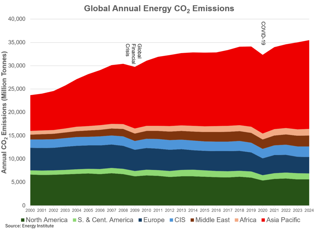
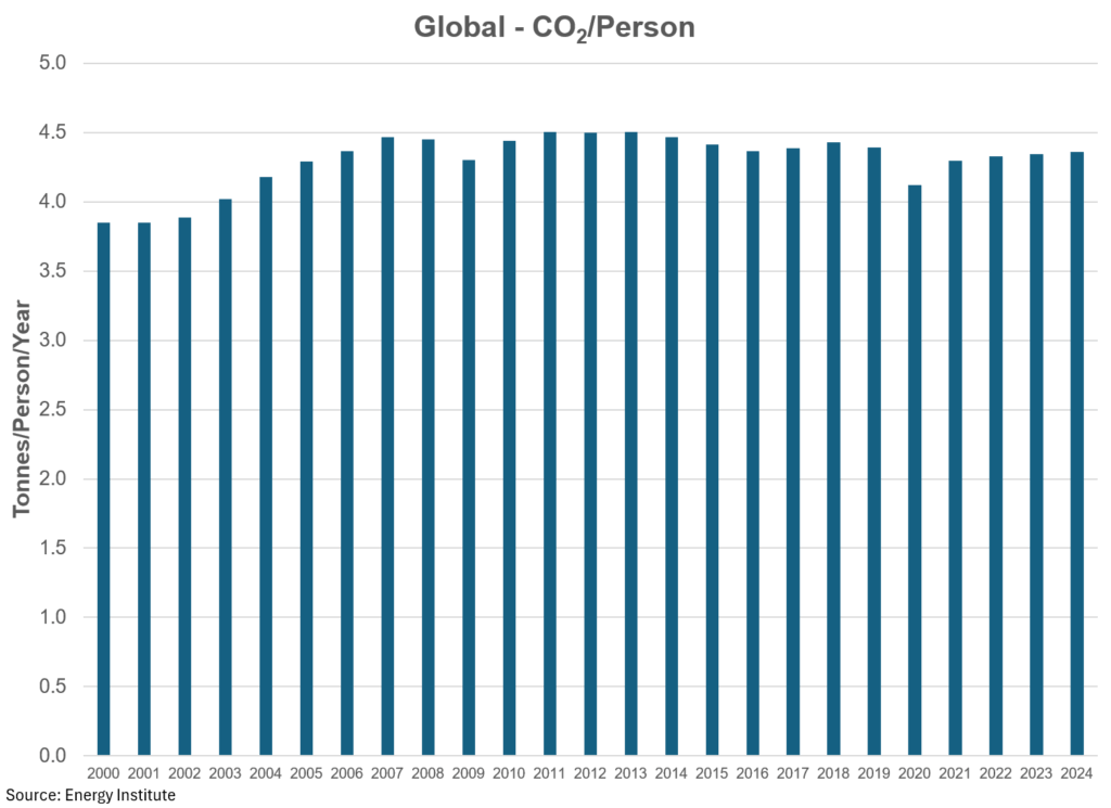
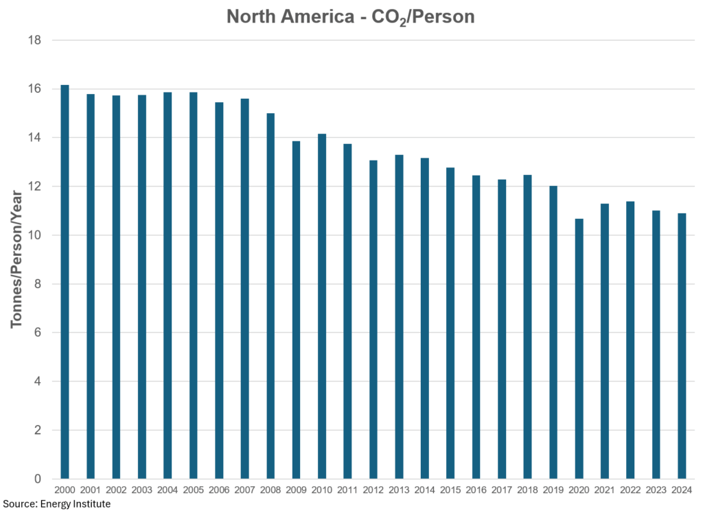
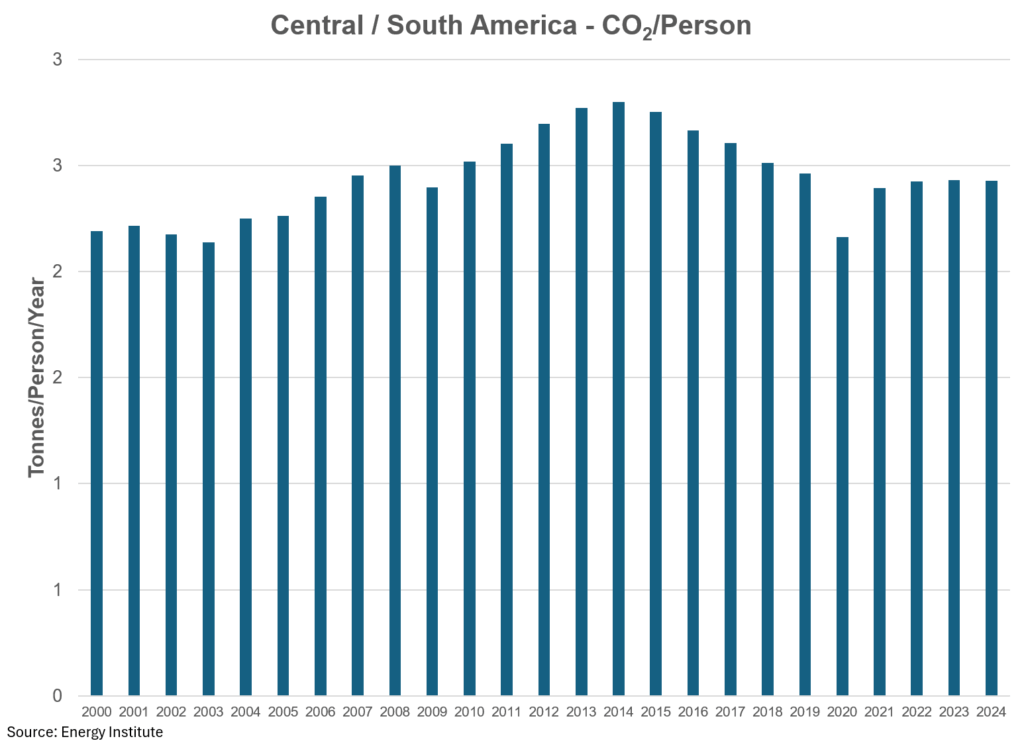
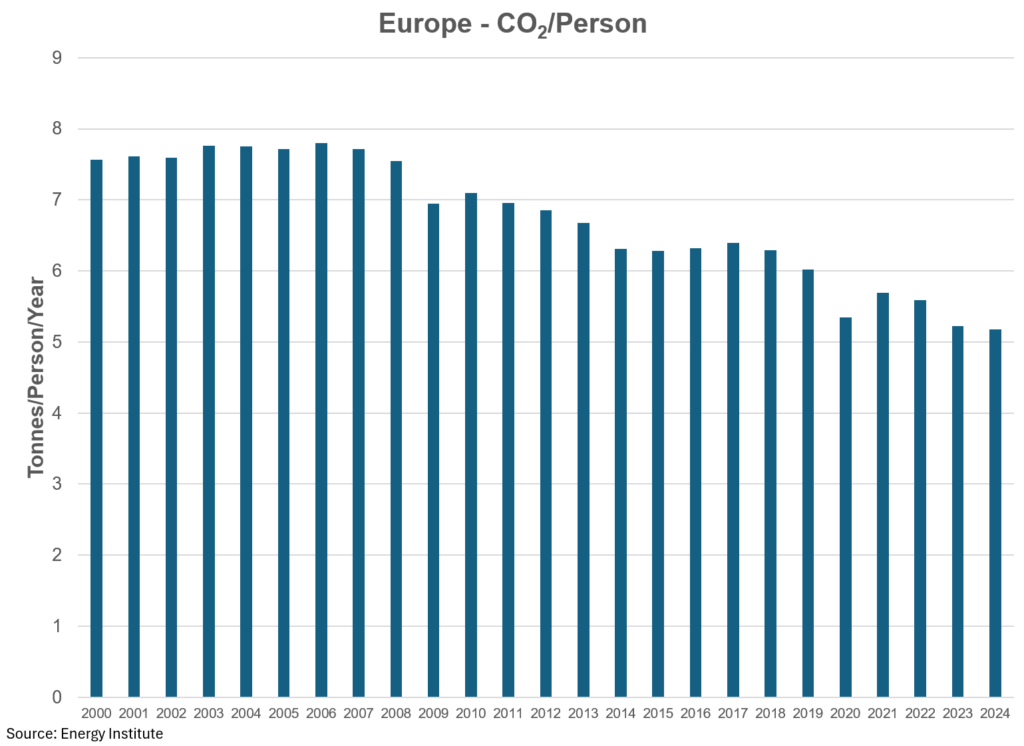
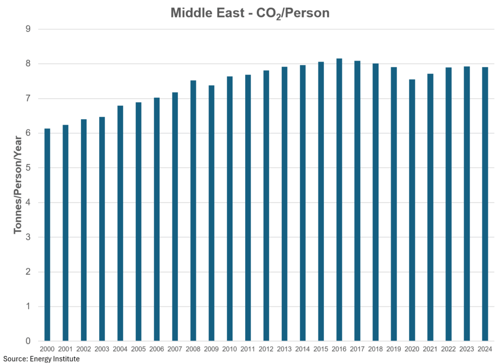
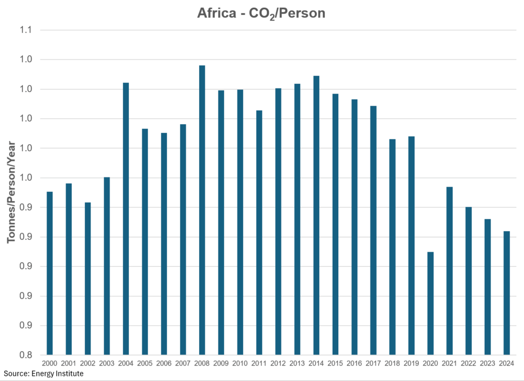
And finally, CO2. As you can see from the chart below, just as the Asia Pacific is the biggest consumer of energy, so too are they the largest emitter of CO2 from energy. However, for CO2, the Asia Pacific region emits 53% of all emissions, while the North America region accounts for 15%, and the other regions are fairly de minimis in the grand scale of things. More interestingly is that emissions per person have essentially been flat since 2007. Again, another statistic I suspect most people would not be aware of.
Cutting to the chase
The globes population has made a steady march higher, adding almost 2 billion people to this rock since 2000. Layered together with flat emissions per person for almost 2 decades, I would argue that the single biggest contributor to rising CO2 emissions has been the addition of 2 billion people, net, to the equation.

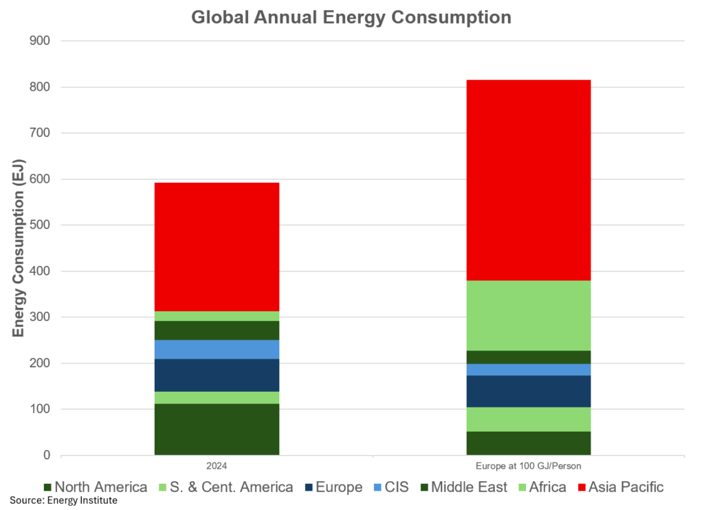
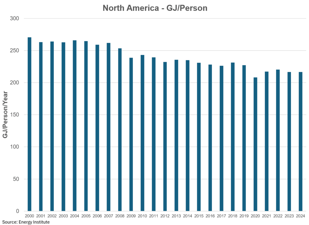
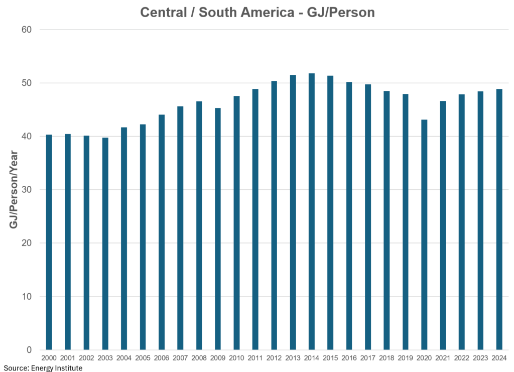
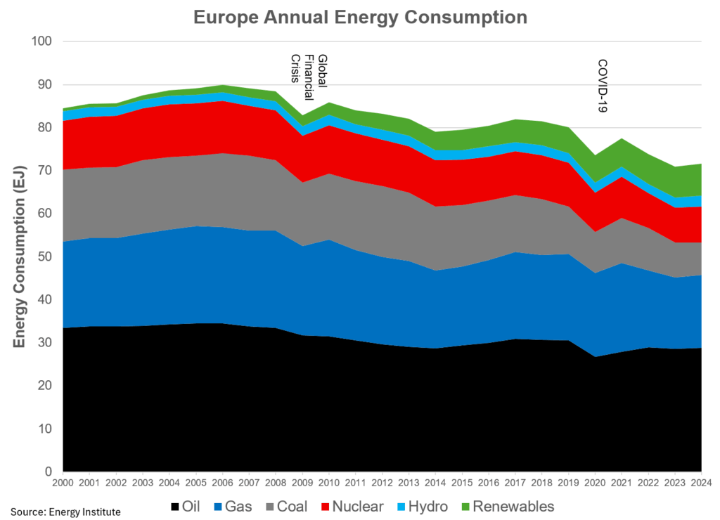
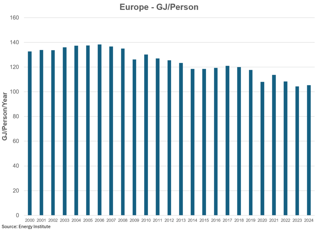
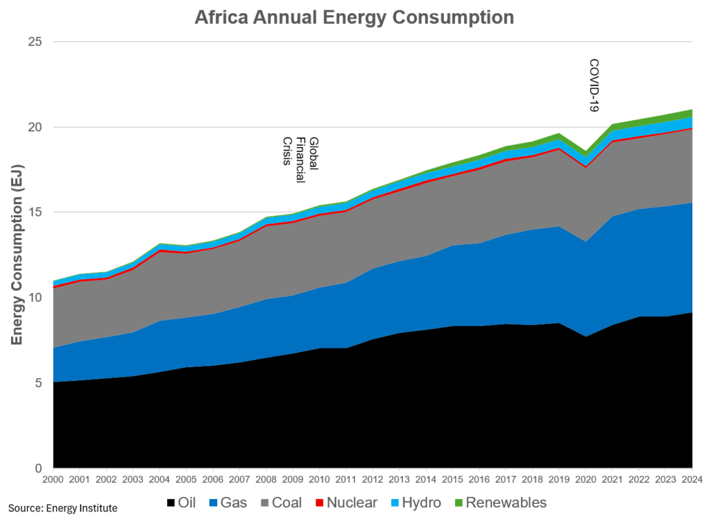
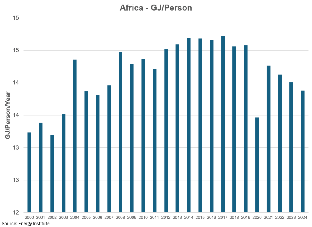
In the charts following you can see how the various regions stack up on a variety of metrics, with the energy abundance title landing squarely on North America (217 GJ/Person) while Africa is energy poor (14 GJ/Person). Meanwhile, Europe (105 GJ/Person) is often touted as being the leader of the energy transition world (fact: 74% of their energy consumed comes from non-renewable sources). So, what would the world look like assuming that European energy consumption (I rounded down to 100 GJ/Person) was the ideal. In short, the world would need 37% more energy than it has today, assuming the population does not change. That would imply that North America would also see the largest drop in energy consumption (54%) while Africa would see the largest gain (620%) followed by Central and South America (104%) and Asia Pacific (56%). Personally, I don’t see many in the West who would be willing to voluntarily undergo energy scarcity, but I do see a lot who want energy abundance in the East.
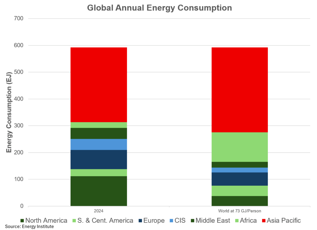
One last thing. If we assume a) the population remains fixed and b) everyone is entitled to the same amount of energy per person, it would imply that everyone is entitled” to 73 GJ per person. In short, North America would have to reduce its energy intensity by 66% while other areas of the world could jump, including Africa (420%), Central and South America (48%) and Asia Pacific (14%). To those who believe this is a realistic idea, I wish you luck.
The truth of the matter is this. The world is, and continues to go through, an energy expansion, not a transition. Those who have energy, want to keep it, while those who do not, want more. We need more of all types of energy.
As with all data, the devil is in the details. As such, I think it is important to dig into those details a bit so that you understand what the makeup of the energy pie looks like and what they contribute to this picture. Below you will find charts for the seven regions in the world and data on:
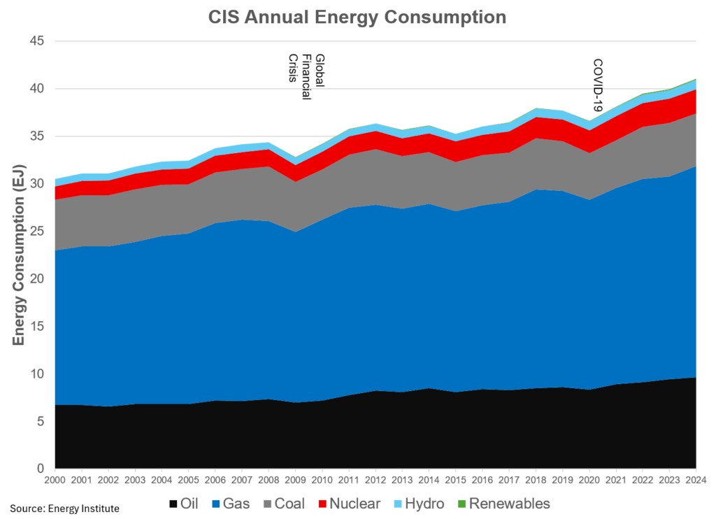
- Total energy consumption and the breakdown by type
- Energy consumption vs. Population
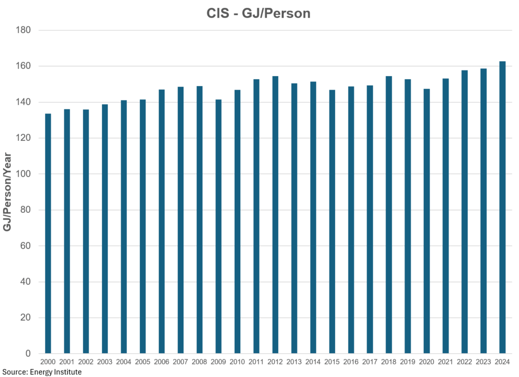
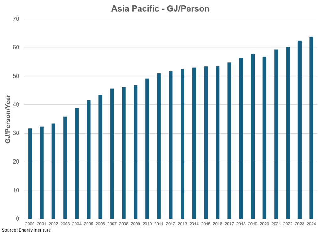
- Energy consumption per person
- Energy consumption versus CO2 emissions
- CO2 emissions per person
Enjoy!
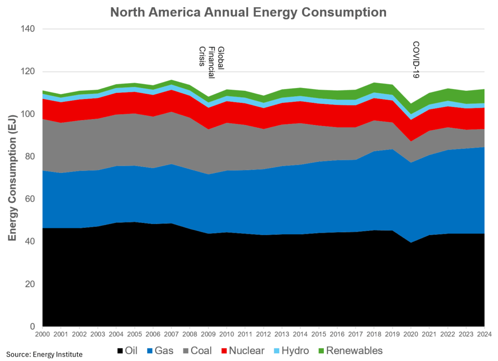
North America Energy
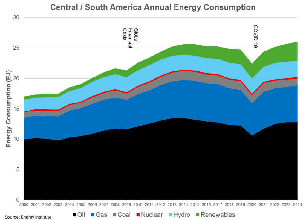
Central and South America
Europe
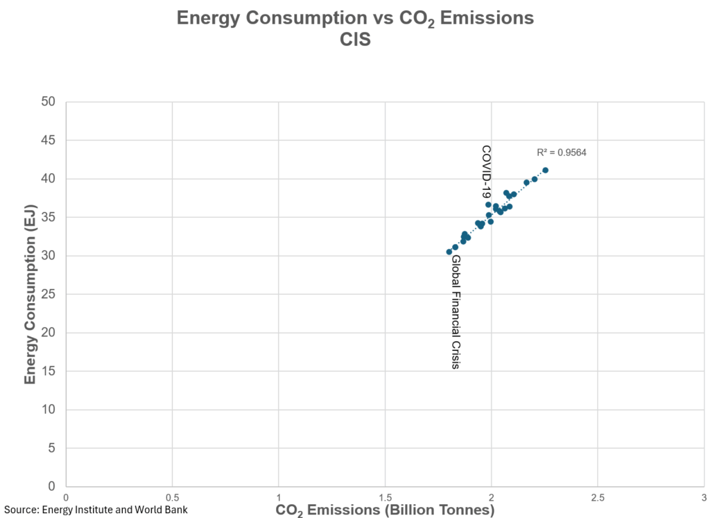
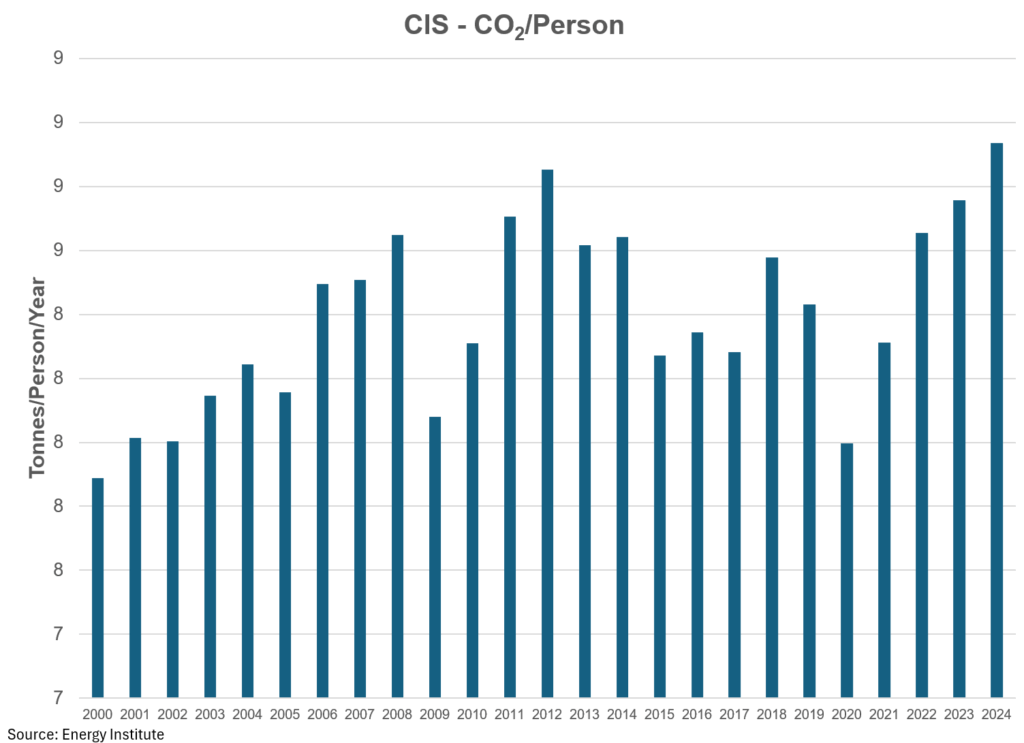
The CIS
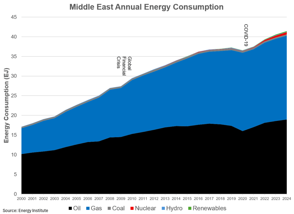
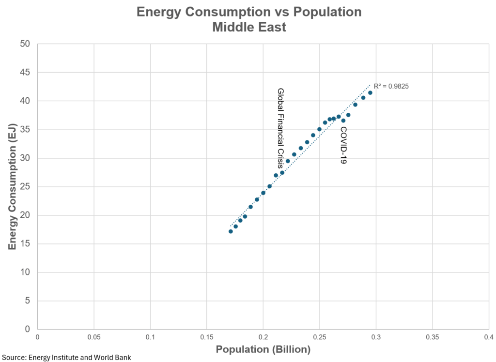
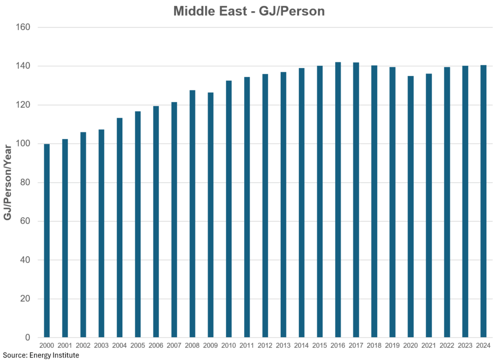
Middle East
Africa
Asia Pacific

Thanks for reading William’s Substack! Subscribe for free to receive new posts and support my work.
Pledge Your Support
Share This: